dromedaris
Newbie

First of all, I'll share two simple tricks that helps one to increase the canvas area in order to allow better overview, especially of schematic pages, but also layouts. The hints may apply to 1600x1200pixel-monitors as well as to 16:10 resp. 16:9-monitors.
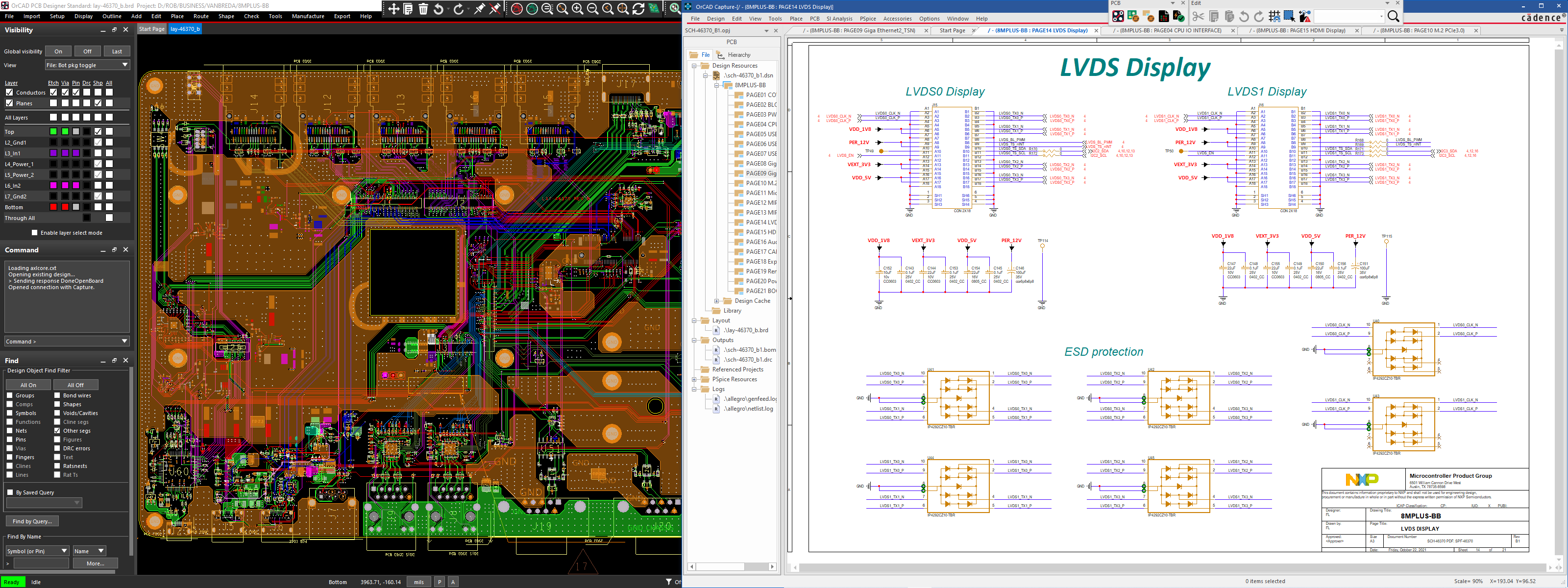
The first trick is to move toolbar segments beyond the default location. I was a bit surprised that even these graphic elements turn into a movable box with a window title bar. I moved them just amidst the title bar of Capture:

I also could move toolbar segments of PCB-editor into the title bar area.
In order to get an A3-format schematic readable in its entirety, I resized the Capture window beyond the left side of the right monitor. The only bottom line of this is that OrCAD "forgets" the window size by doing this, unless I double click on the title bar (fit in monitor window) before closing the application. According to the status bar (far right side), the A3-sheet scales to 90%. That's not bad, but adds to sharpness reduction of text. If I'd zoom in 12 per cent, texts get better readable substantially. This was one reason to order a new monitor offering 1440 pixel height.
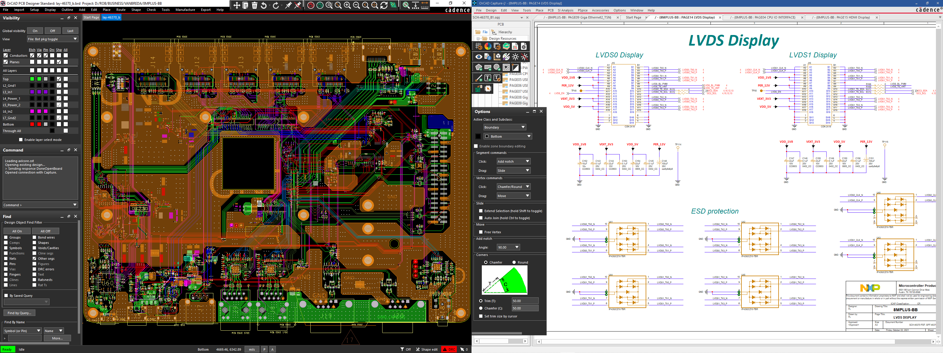
Another toolbar-trick help to re-use the full size of toolbar segments beyond the limited space on the right half of the title bar. See next screenshot, when the PCB-editor is the active window:

Toolbars and context dependent options windows can be placed outside of the left monitor area. That they overlap the project tree of Capture is quit harmless (when the Capture window is "double clicked" into its own monitor area).
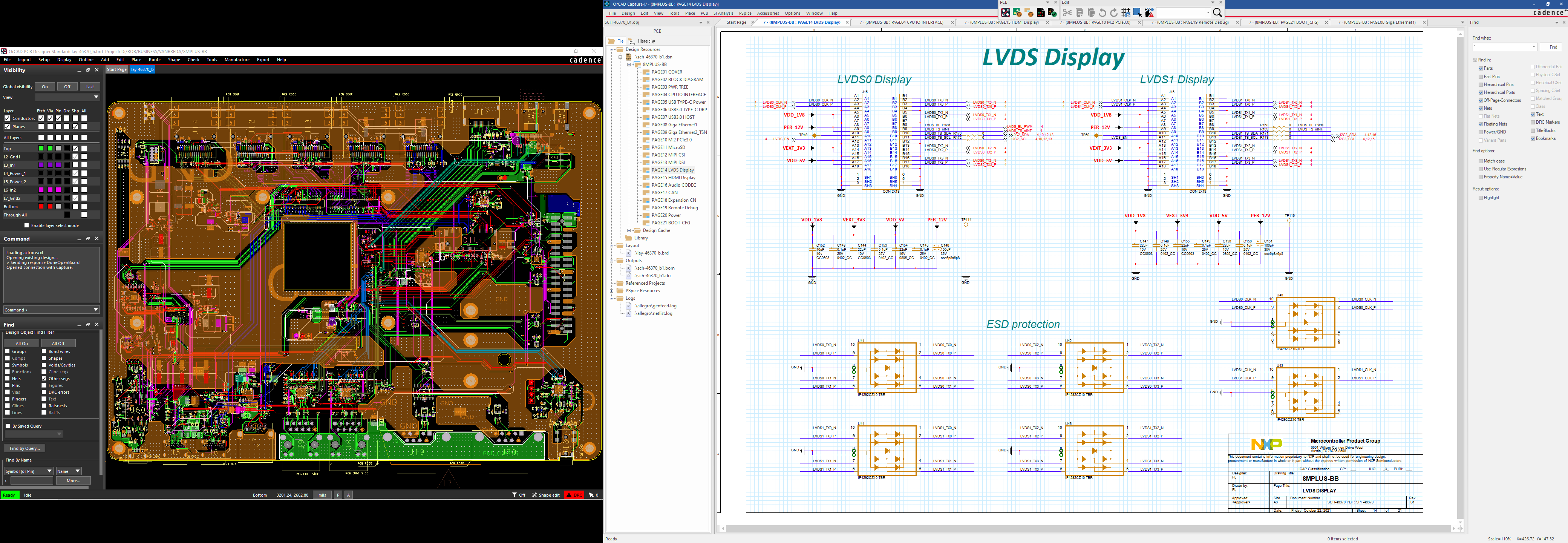
However, since schematic readability is still suboptimal (referring to the first screenshot), I have now installed a 24" QHD-monitor (2560x1440px) in place of the former 20" 4:3-monitor. Net display height differ only slightly. It appears that the schematic in full size is clearly better readable - provided the automatic windows magnify parameter (125% with this display) is overridden manually and set to 100%. That's very important, because 125% adds anti-aliasing sharpness deterioration. Next screenshot documents this setup (with 100%). Having said this, I hesitate about the idea of using 4K-displays, because GUI-elements could appear too small to be comfortable at the sharpness-optimal 100% setting of Windows magnification. In this case, default system font setting increases are the way to go - if the application is based upon them.

Of course, in reality, the left side appears at comparable height as the right side. If you compare the screenshots in original size, this one will prove the better readability of small text. Of course, toolbar segments could be placed vertically alongside the monitor edge (alas no option to insert between project tree and canvas exists). Note that the A3-sheet is displayed at 110% scale according to the status bar. This leaves a bit headroom to add the bottom window section with e.g. text search results.
Of course, the situation when PCB-editor is active does not differ much. Therefore a screenshot with this monitor update for the schematic side is not inserted here.
The first trick is to move toolbar segments beyond the default location. I was a bit surprised that even these graphic elements turn into a movable box with a window title bar. I moved them just amidst the title bar of Capture:
I also could move toolbar segments of PCB-editor into the title bar area.
In order to get an A3-format schematic readable in its entirety, I resized the Capture window beyond the left side of the right monitor. The only bottom line of this is that OrCAD "forgets" the window size by doing this, unless I double click on the title bar (fit in monitor window) before closing the application. According to the status bar (far right side), the A3-sheet scales to 90%. That's not bad, but adds to sharpness reduction of text. If I'd zoom in 12 per cent, texts get better readable substantially. This was one reason to order a new monitor offering 1440 pixel height.
Another toolbar-trick help to re-use the full size of toolbar segments beyond the limited space on the right half of the title bar. See next screenshot, when the PCB-editor is the active window:
Toolbars and context dependent options windows can be placed outside of the left monitor area. That they overlap the project tree of Capture is quit harmless (when the Capture window is "double clicked" into its own monitor area).
However, since schematic readability is still suboptimal (referring to the first screenshot), I have now installed a 24" QHD-monitor (2560x1440px) in place of the former 20" 4:3-monitor. Net display height differ only slightly. It appears that the schematic in full size is clearly better readable - provided the automatic windows magnify parameter (125% with this display) is overridden manually and set to 100%. That's very important, because 125% adds anti-aliasing sharpness deterioration. Next screenshot documents this setup (with 100%). Having said this, I hesitate about the idea of using 4K-displays, because GUI-elements could appear too small to be comfortable at the sharpness-optimal 100% setting of Windows magnification. In this case, default system font setting increases are the way to go - if the application is based upon them.
Of course, in reality, the left side appears at comparable height as the right side. If you compare the screenshots in original size, this one will prove the better readability of small text. Of course, toolbar segments could be placed vertically alongside the monitor edge (alas no option to insert between project tree and canvas exists). Note that the A3-sheet is displayed at 110% scale according to the status bar. This leaves a bit headroom to add the bottom window section with e.g. text search results.
Of course, the situation when PCB-editor is active does not differ much. Therefore a screenshot with this monitor update for the schematic side is not inserted here.